How clear and simple data visualizations bring the climate crisis home
Data visualizations are some of the most powerful tools in a climate science communicator's playbook. The most famous have taken on enormous symbolic value-like the "Hockey Stick" graph showing rising temperatures in the Northern Hemisphere since the year 1000.

The original "hockey stick" graph, as presented by Michael Mann, Raymond S. Bradley, and Malcolm K Hughes in their 1999 Geophysical Research Letters paper, "Northern hemisphere temperatures during the past millennium: Inferences, uncertainties, and limitations." American Geophysical Union / Chinese Geophysical Society
But designing climate visuals that are clear to the public and policy makers is not a straightforward task. Many scientific graphics, such as those in reports of the International Panel on Climate Change (IPCC), are designed for technical accuracy and often assume a specialized audience. As a result, they can be difficult to interpret. Prior research has shown that widely used scenario graphs can confuse viewers. For example, people often mix up uncertainty about future emissions scenarios with uncertainty in the climate models themselves.
At the same time, there is growing evidence that more intuitive visualizations, informed by psychological research, can help people make better sense of climate data. For example, one study showed that simply highlighting rising temperatures in red increased support for climate action among liberal viewers.
This challenge-how to make climate visuals more meaningful to the public-was the motivation behind the recent study I published in Nature Human Behavior with my colleagues in Princeton's computer science department. We wanted to know whether some kinds of data visuals can help make climate change feel more concrete and better reflect the urgency of the crisis.
We ran a series of experiments with over 2,000 participants. Each person was introduced to a fictional town and shown data about how its winters had changed over time. One group saw a standard chart showing a gradual rise in average winter temperature. The other group saw a binary chart indicating whether the town's lake froze each year. Importantly, both charts reflected the same underlying climate trend. However, people's responses were very different.
People who viewed the binary "froze or not" charts consistently rated climate change as having had a more severe and more noticeable impact on the town, compared to those who viewed the temperature charts. That is, when climate impacts are presented in black-and-white terms, people seem to take them more seriously.

The 'binary data' effect. Both graphs reflect equivalent climate change trends over time, but the binary lake data is perceived as more striking than the gradual temperature data. Liu et al. 2025
An upward slope on a temperature chart may seem gradual or unimportant. But a switch from "lake froze" to "lake didn't freeze" captures a threshold. Something that used to happen no longer does. That feels different. Personal.
Our findings call for a re-think about how we communicate climate change.

Intergovernmental Panel on Climate Change

Ed Hawkins, National Centre for Atmospheric Science, University of Reading

Nadja Popovich, The New York Times
Sara Chodosh, The New York Times
NSIDC/NASA

The Economist

Climate Central

RolfsWeather.github.io

Simon Jockers

Climate Central

Climate Central
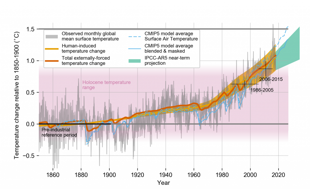
One of the most common ways to show its effects is through rising temperatures. A typical IPCC graph might show global mean temperatures increasing over the past century. These graphs are comprehensive, but they can also be difficult to interpret and often feel abstract.
A more striking alternative is the climate stripes graphic, which compresses over a century of data into a series of blue-to-red color shifts. The result is a sharp visual transition, and while the chart doesn't include any numbers, the message is hard to miss. It also introduces a kind of binary framing: cold vs. hot, blue vs. red, normal vs. not.
Other graphics build on this idea. One New York Times graphic, for example, overlays a traditional temperature chart with color-coded shading to make recent warming more visually salient.
Separately, in a piece by Zeke Hausfather, also in the Times, the trend is broken into three color-coded segments and animated to draw attention to how warming has accelerated in the past 15 years. This kind of design encourages "step-wise" thinking, prompting viewers to interpret the warming not as slow or gradual, but as a sudden shift. That's the same kind of perception we observed in our own study.
The same lesson applies to how we visualize the loss of Arctic sea ice. NASA's standard line graphs show the area of sea ice declining over the past few decades. These are clear in a technical sense, but they ask viewers to interpret a slope and mentally translate that into real-world loss.
There are ways to make this loss feel more concrete. One graphic from The Economist, for example, distills the long-term decline into three snapshots: sea ice coverage in 1980, 2000, and 2019. By grouping the data this way, the charts emphasize not a gradual slope but a step-wise pattern of loss. Viewers don't need to track exact numbers. They just need to register the shrinking boundary of Arctic ice to understand what has disappeared.
While temperature and sea-ice visuals often show large-scale, abstract trends, it's even more important to communicate how climate change is affecting everyday life.
One culturally familiar and concrete example is the gradual disappearance of white Christmases. This phenomenon is typically shown using winter temperature or snowfall graphs, which are informative but can feel detached.
In contrast, some graphics take a more localized and personal approach-marking each year in a specific city, like Toronto or Berlin, as either a white Christmas or not.
This kind of yes-or-no framing mirrors the design of our lake-freeze study and may be more effective at conveying what's been lost, especially when tied to familiar places.
Localizing and familiarizing climate change further, Climate Central has created several graphics showing how climate change is influencing different cultural activities across the United States. For example, one graphic shows how rising temperatures are affecting football season in different US cities.
These visuals link climate trends to specific teams and locations, making the effects of warming feel more immediate-especially for audiences that might not connect with global averages.
Our usual ways of visualizing climate change can make its effects feel more abstract than they really are. But the changes are no longer subtle. We don't need to overcomplicate the message. Often, the most effective visuals are the simplest ones: a lake that no longer freezes, an Arctic boundary that has visibly shrunk, a Christmas without snow.
What these examples share is a kind of visual simplicity. They don't require viewers to interpret detailed numbers or statistical results to see what's changed. Instead, they use contrast, familiarity, and visual structure-sometimes binary, sometimes categorical-to make the message easier to grasp. These are the kinds of cues that can help make climate change feel less like a slow drift and more like a rupture in the world as we knew it.
One of the clearest illustrations of this comes from an xkcd comic that plots Earth's temperature over the past 22,000 years. For most of the chart, the line barely moves. Then, in the final few panels, it veers sharply upward. The message is simple and hard to unsee. You don't need a legend or complicated analysis to get it. You just need to look.