Making maps that matter: four ways to improve hazard maps
When was the last time you used a map? To locate somewhere on campus, in an airport, or perhaps during fieldwork? Maps are something we often take for granted. While it can be frustrating, we may not even notice when maps do not communicate their message effectively. For most of us, this might be inconvenient at worst. However, when maps are used to convey the danger from natural hazards, their content and design is crucial to the many people living in harm’s way.
Volcanic hazard mapping
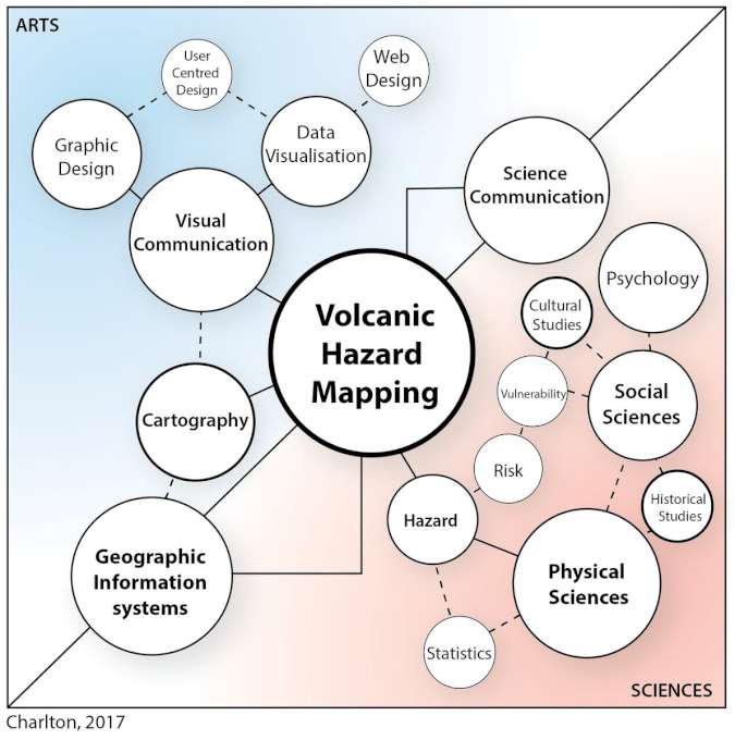
To reduce risk near a volcano, only a single type of hazard map is usually produced. These maps are generally created in isolation without input from the intended audience. In addition, the design of the map is often overlooked and is not considered as much as the data presented. My research explores how to improve both map design and audience involvement to make hazard maps more effective.
Hazard communication at Campi Flegrei
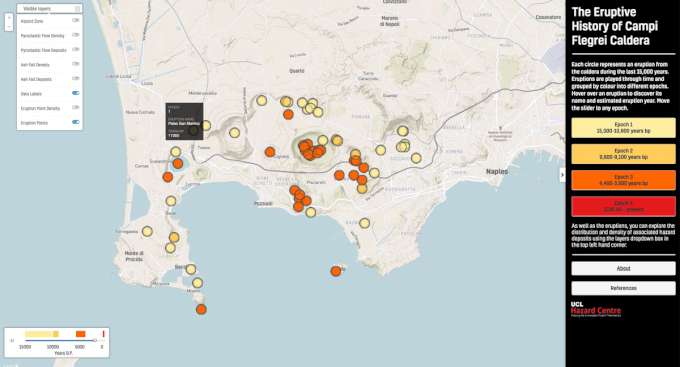
My PhD focuses on hazard communication at the volcanic Caldera of Campi Flegrei in Southern Italy, one of the most dangerous volcanoes in the world. The range of hazards and the large resident population allow me to investigate different aspects of hazard communication with maps. As part of my investigations, I identified several topics thought to be useful to the diverse range of audiences in this area. These included: examining the underlying scientific assumptions within hazard maps, investigating the needs and preferences of map users, developing hazard scenarios, and creating new interactive web maps. Recommendations for hazard maps were derived from this work, which I hope will be investigated further and used within hazard management strategies. The four main recommendations are described below.
Four ways to improve hazard maps
- Different maps should be designed for different types of users. A single map will not suit everybody or even the majority of your target audience. While this may seem obvious, this is often not considered when designing hazard maps. As with all populated volcanic regions, the authorities in Campi Flegrei have the difficult task of trying to communicate different aspects associated with the hazard (e.g evacuation, probabilities, alert levels, closures, and impacts), to many different user types. These might include different cultures, countries, genders, ages, occupations, education level, and disabilities. Where possible, a suite of maps would be the ideal solution. This reflection on the 1991 Pinatubo eruption in the Philippines highlighted how maps were used and the difficulties experienced.
- Map users should be involved in the process of map making. This has been done to some degree in flood risk mapping but is not common enough with other hazards. Consultations can take place through online surveys, town hall meetings, talks, or interviews. Asking users what they think might highlight unexpected and interesting results. My study demonstrated clearly that information not commonly included in volcanic hazard maps, such as evacuation routes, should be shown alongside hazard.
- Develop interactive web maps for hazards. Increasingly, maps are being shown online and are adapting to how we use the internet. These can be static or interactive. Exploring the multiple benefits of interactive web maps was the most exciting part of the project, as it combines technology, design, psychology and science. I had to learn how things are made online and how user centred design is beginning to play an increasing role in how decision makers develop communication tools. Crisis maps are a particularly good example of where web mapping would be extremely beneficial. As part of my work, I created a guide to developing web maps.
- Use an interdisciplinary approach to hazard map design. Effective hazard maps should bring together elements of science, technology, and design to improve the functionality of the end product. Aside from my PhD, I was lucky to be part of a great interdisciplinary GCRF project following this approach. The production of hazard maps is a fantastic opportunity where disciplines and expertise can be combined and used to create richer maps.
No matter how good hazard maps are, there is no guarantee that people follow recommendations or react as expected in an emergency. However, following these recommendations can help develop maps that are more usable, useful and used by many more within volcanic regions
Danielle Charlton is a PhD student based at UCL hazard centre, University College London. Her thesis focuses on creating volcanic hazard maps to improve disaster preparedness at Campi Flegrei volcano, Southern Italy. She also works on how GIS, graphic design, hazard science, and technology can be brought together to adapt to online and social media.